One of the most visually defining decisions in wedding planning is choosing the colours for your bridesmaids. Long before guests notice the florals or table settings, they see the bridal party walking down the aisle—and the colours your bridesmaids wear quietly set the tone for your entire celebration.
Yet this decision is rarely as simple as picking a shade you love.
Brides often find themselves balancing personal taste with cultural traditions, seasonal realities, venue aesthetics, skin tones, body types, and the comfort of the women standing beside them. In Sri Lanka especially, where weddings blend heritage, climate, and modern styling, choosing the right bridesmaid colours requires more thought than scrolling through a Pinterest board.
This guide walks you through how to choose bridesmaid colours with confidence—so your wedding looks cohesive, elegant, and authentically you.
Why Bridesmaid Colours Matter More Than You Think
Bridesmaid dresses do more than complement the bride. They act as a visual bridge between the bride and the décor, between tradition and modernity, and between individual personalities and a unified aesthetic.
Well-chosen colours:
- Elevate your wedding photos
- Enhance the venue’s natural beauty
- Flatter a diverse group of women
- Create emotional harmony and visual calm
Poorly chosen colours, on the other hand, can clash with lighting, overpower the bride, or make bridesmaids feel uncomfortable—something that shows in every photograph.
The goal is not perfection. It’s balance.
Start With Your Wedding Vision, Not Trends
Before looking at colours, step back and define your wedding’s overall mood.
Ask yourself:
- Is my wedding romantic, minimal, traditional, modern, or playful?
- Does it feel soft and intimate or bold and celebratory?
- Am I leaning towards timeless elegance or contemporary style?
A soft, garden wedding may naturally lend itself to muted pastels or earthy neutrals, while a grand ballroom or hotel wedding can carry deeper jewel tones or structured neutrals beautifully.
Trends can inspire, but they should never dictate. What looks stunning online may feel disconnected from your venue, your culture, or your personal style. Bridesmaids’ colours should support your story—not distract from it.
Let the Venue Guide Your Colour Palette
Your venue is one of the strongest influences on colour choice.
Outdoor and Garden Weddings
Natural light, greenery, and open spaces pair beautifully with:
- Blush, dusty rose, soft peach
- Sage, eucalyptus, muted olive
- Lavender, pale blue, champagne
These shades feel organic and photograph softly in daylight.
Beach Weddings
Coastal settings benefit from airy, reflective tones:
- Sand, ivory, soft taupe
- Seafoam green, pale aqua
- Powder blue, muted coral
Avoid overly dark colours, which can feel heavy under bright sun.
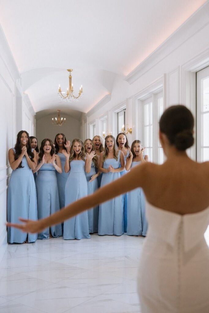
Indoor, Hotel, or Ballroom Weddings
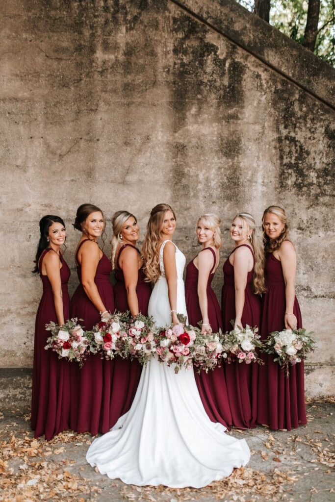
Structured spaces with controlled lighting allow richer colours:
- Emerald, wine, burgundy
- Navy, charcoal, deep plum
- Metallics like bronze or soft gold
Here, the environment can carry dramatic tones without overwhelming the bride.
Consider the Season and Climate
Sri Lanka’s climate plays a practical role in colour selection. Heat, humidity, and lighting all influence how colours appear and how comfortable your bridesmaids feel.
Lighter shades reflect heat better and feel fresher during daytime ceremonies. Deeper tones work well for evening weddings or air-conditioned venues.
Also consider how certain colours behave in sunlight. Some shades deepen or shift under natural light, while others may photograph brighter than expected. Testing fabrics in similar lighting conditions can prevent surprises.
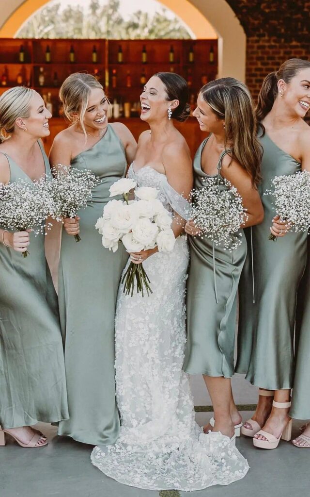
Think About Skin Tones and Inclusivity
Your bridesmaids are real women with different complexions, body types, and comfort levels. A colour that looks stunning on one person may not flatter another the same way.
Universally flattering shades tend to include:
- Dusty rose
- Soft mauve
- Navy
- Champagne
- Sage green
These colours adapt well across skin tones and photograph evenly.
If you’re drawn to a bolder or more unusual colour, consider variations within the same colour family. This allows individuality while maintaining cohesion.
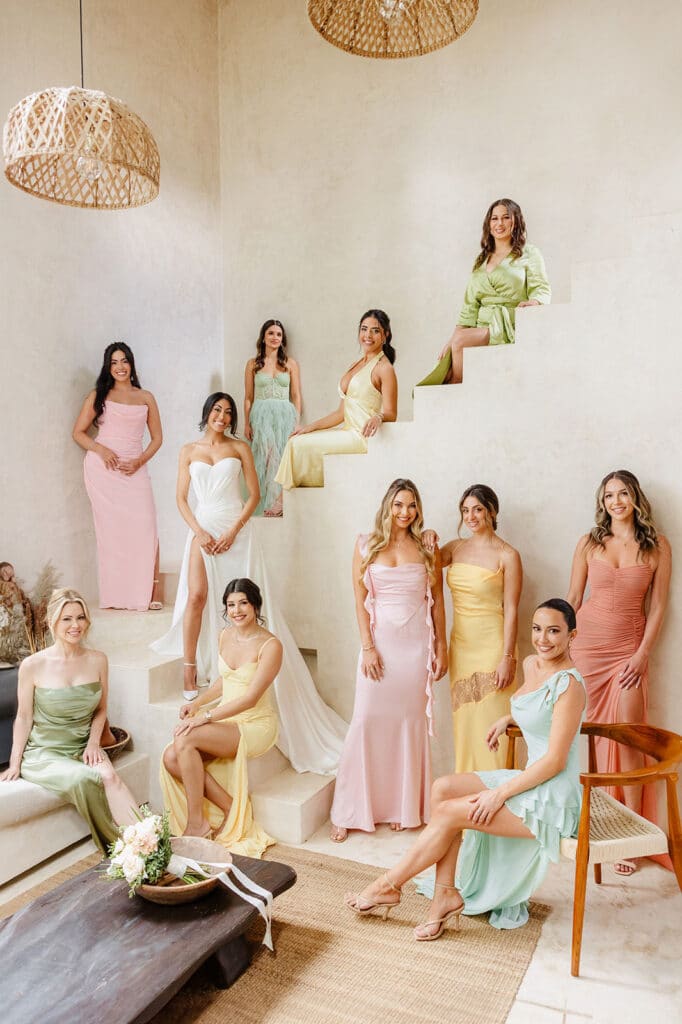
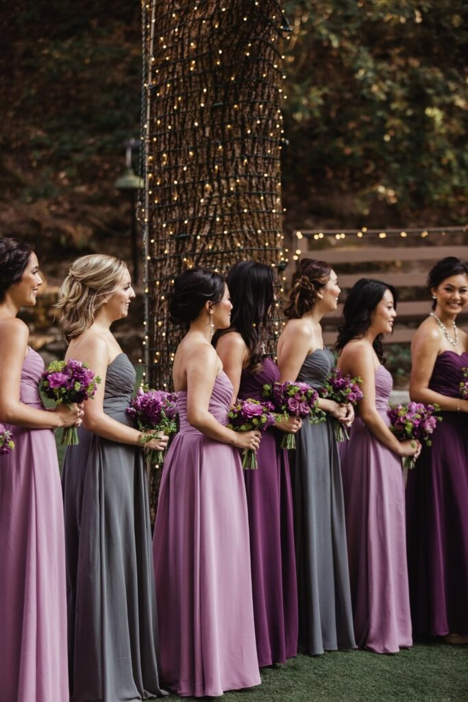
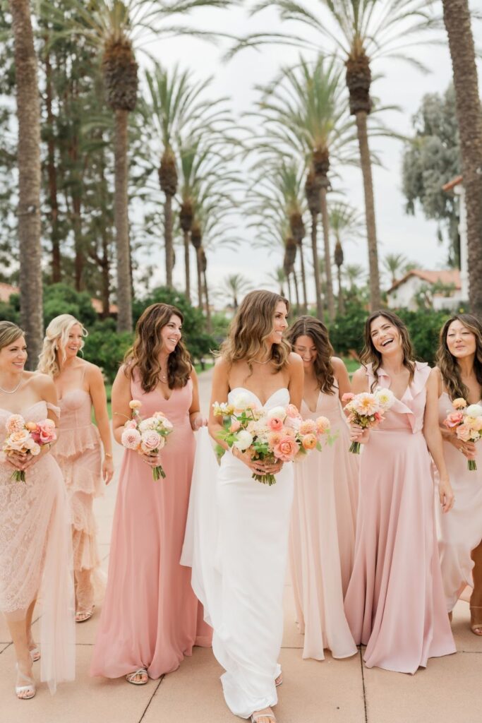
One Colour or Many? Finding the Right Balance
Modern bridal parties no longer need to look identical to look unified.
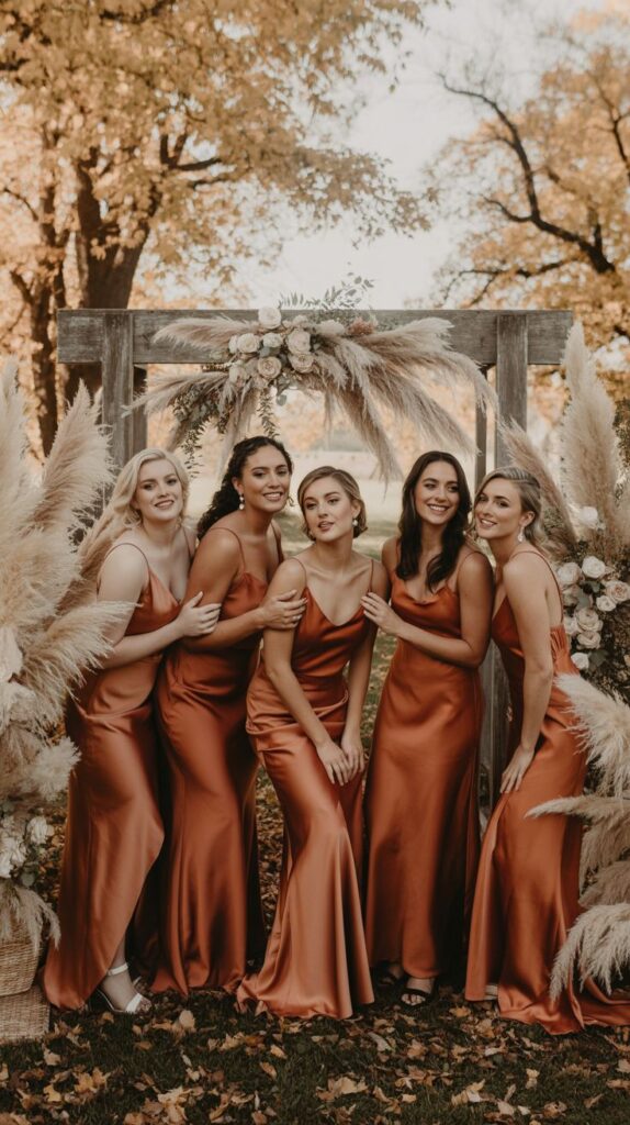
Single Colour, Same Shade
Classic and elegant, this works well for formal weddings. Ensure the fabric and cut flatter everyone, or allow slight dress variations.
Single Colour, Multiple Shades
Using different tones of the same colour—like blush through rose—adds depth and softness while keeping the palette cohesive.
Mixed Colours Within a Palette
Carefully chosen complementary colours can look intentional and stylish when tied together with:
- Matching fabrics
- Similar silhouettes
- Coordinated accessories
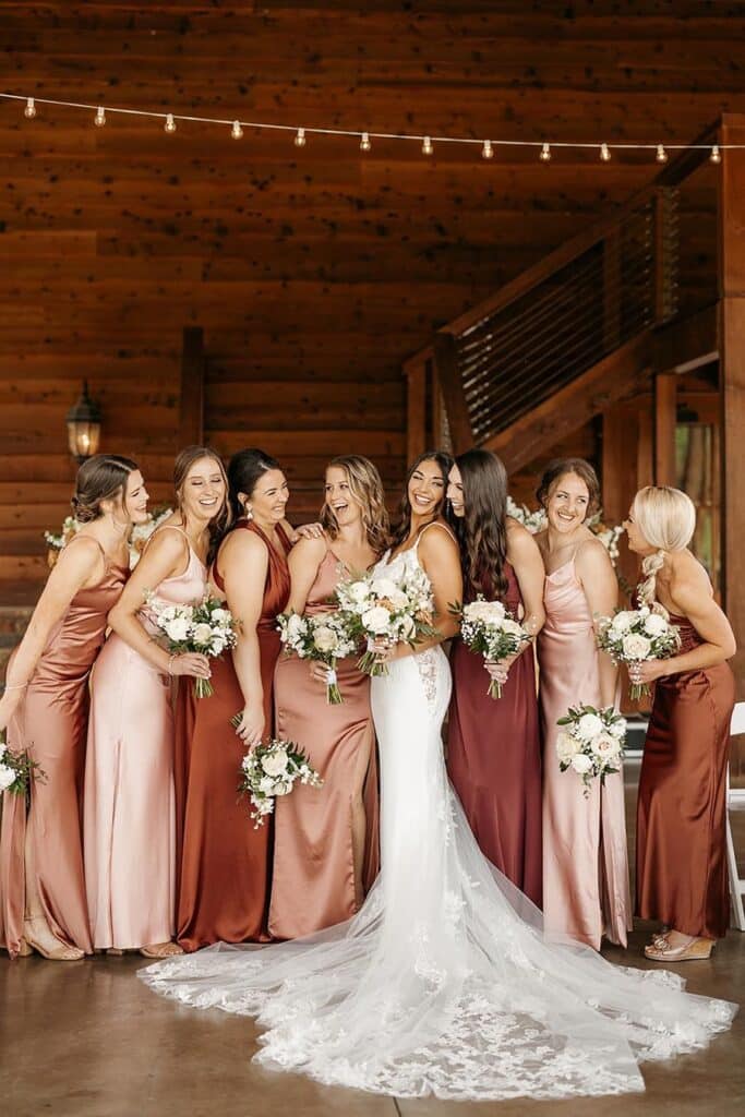
The key is control. Too many colours without a clear plan can appear chaotic rather than artistic.
Align Bridesmaid Colours With the Bridal Look
Your bridesmaids should complement—not compete with—you.
If your bridal outfit is heavily embellished or traditional, softer bridesmaid colours create balance. If your look is minimal and modern, structured or deeper tones can elevate the overall aesthetic.
Also consider jewellery, bouquet colours, and makeup. Everything should feel connected, even if subtly.
Cultural Sensitivity and Personal Meaning
Colour carries cultural meaning, especially in Sri Lankan weddings. Some families may associate certain colours with tradition, celebration, or symbolism.
Rather than seeing this as a limitation, treat it as an opportunity. Blending cultural significance with modern styling often results in deeply meaningful and visually rich weddings.
Open conversations—with family and bridesmaids—help you make choices that feel respectful without compromising your vision.
Fabric Matters as Much as Colour
The same colour can look entirely different depending on fabric.
- Chiffon feels soft and romantic
- Satin reflects light and appears richer
- Crepe offers modern structure
- Organza adds dimension and volume
Always view colour samples in the intended fabric. Lighting and texture can dramatically alter the final look.
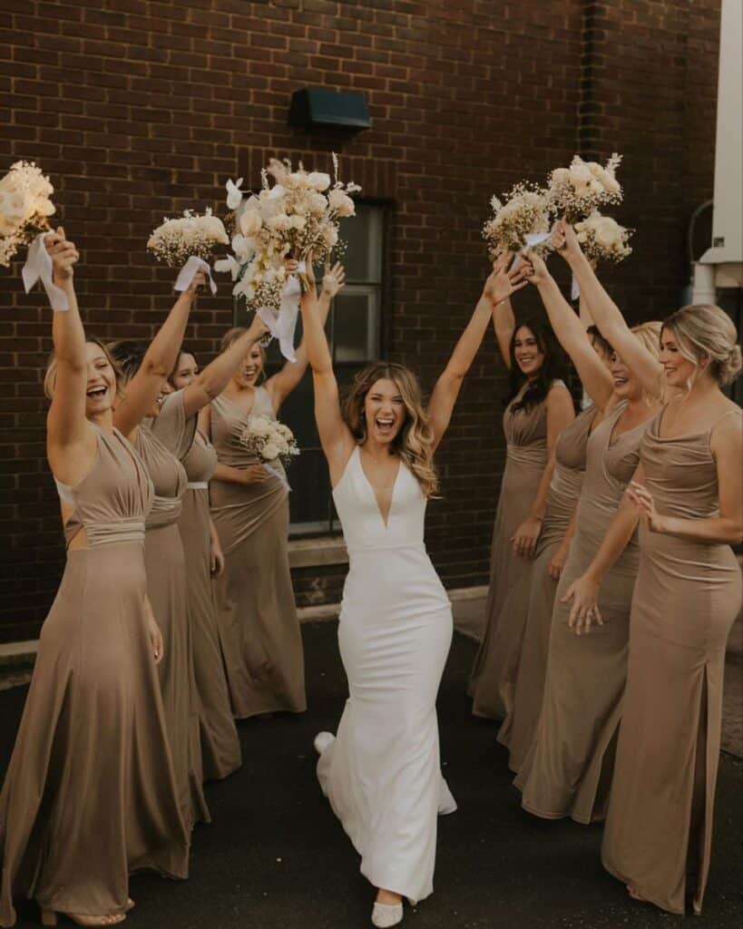
Comfort Is Not Optional
Uncomfortable bridesmaids don’t photograph well.
Consider:
- Breathable fabrics
- Cuts that allow movement
- Colours that don’t show sweat easily
- Designs suitable for Sri Lanka’s climate
When your bridesmaids feel confident and comfortable, it shows in their posture, expressions, and energy throughout the day.
Avoid Common Colour Mistakes
Some pitfalls to watch out for:
- Choosing a colour without testing it in natural light
- Ignoring the venue’s existing colour scheme
- Forcing one shade on all bridesmaids without flexibility
- Following trends that don’t suit your wedding style
Thoughtful planning avoids regret later.
Trust Your Instincts, Not Outside Noise
Everyone will have an opinion—family, friends, social media. Listen respectfully, but remember this: your wedding is not a performance. It’s a reflection of you.
If a colour feels right—emotionally and visually—it probably is.
Final Thoughts: Cohesion Over Perfection
Choosing bridesmaid colours is not about achieving a flawless Instagram look. It’s about creating harmony—between people, place, and purpose.
When colours align with your vision, respect your bridesmaids, and suit the setting, your wedding will feel effortless and timeless.
And that is what people remember long after the flowers fade.